To my knowledge, the visual arts do not get the same type of treatment. While you may be able to find "art theory" classes (if you're lucky), I would find it incredibly surprising if artists were required to study as much theory as their music-major counterparts.
But then again, they are subject to completely different circumstances. Most, if not all, visual art students study the creation of art, whereas only a small portion of music students study specifically to composer. After all, they are completely different media. Music is all about how things happen over time; it is impossible to experience a musical piece all at one moment. Art, on the other hand, is grounded in the simultaneous. You may appreciate smaller details about a piece of art after viewing it for some time and focusing on smaller parts, but the viewing essentially occurs in an instant. Additionally, music (although this paradigm is completely changing with the use of recordings, electronics, and most specifically sequencers that eliminate this need) requires a slew of performers to realize the creation of the composer. Art requires no one except the artist.
However, there is at least one similarity that makes the task of formally analyzing a piece of art a much more conceivable goal. In music analysis, it is common to hear the word "color" when referring to intentional deviations from a more diatonic setting. If this concept can justly be referred to as "color," then it is easy to find a parallel in visual art, since "color" is generally thought to be a visual concept. But is this necessarily a formal element?
The very term "color" in music occurs most often in discussion of modal mixture. Thus, there is clearly a frame of reference required for the term to even come into play. An Ab major chord may not be particularly exciting or colorful, unless it is used in a piece that is in a key like C major. Thus, it is not the specific chords in music or elements of art that become important, but rather the differences and contrasts, the deviation or fulfillment of created expectations, that gives something its formal relevance. Now we have something more formal to work with.
The "form" of a piece of music is determined by the relationships between larger sections of these expectation-fulfillment or expectation-defiance elements. With our previously-defined method for formal analysis on a smaller scale, defining larger form in visual art becomes easier. We can see it as the relationships between larger sections of a piece of art as it relates to structural or color elements. Just as in music, the content itself, or the setting of the smaller elements, may be worth noting, but is not of primary importance to a formal analysis.
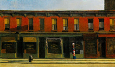
So now, with these ideas in mind, I will undergo my attempt (seeing as I have very limited art knowledge) to formally analyze Edward Hopper's Early Sunday Morning. Admittedly, I studied Hopper in high school, so I have a bit of a head start with the research I have previously done, but I will try to keep my analysis fresh.
 The first thing, upon viewing this piece, that strikes me is the clearly-defined color sections. There is a blue of the sky at the top, the strip of greenish-gray at the top of the buildings, the red of the second floors, down the the green of the storefronts, and the yellow of the street. But within those sections, there are deviations that make things more interesting. The sky has a piece of the building jutting into it, the strip of greenish-gray actually has hints of red thrown in, the second floor sports the irregularly-colored windows (some of which have yellow blinds, others do not), the storefronts are littered with colored awnings, windows, and text, as well as a barber's pole and a specific store that for some unknown reason is colored differently, and the yellow of the ground has the fire hydrant. Throughout the lower of these sections, shadows cut through in somewhat inconsistent directions.
Additionally, the barber's pole stands out by sporting diagonal stripes of color, while the rest of the painting is dominated by strong horizontal lines.
1 comment:
Hey!!! By the way, I got Musicophelia, and it's really good so far...thanks for the recommendation!
~KT
Post a Comment